SONY HEADPHONES APP Case Study
Overview:
Headphones connect is a UX/UI redesign to enhance the Sony Headphones app. As a Sony headphones user, I experienced firsthand the frustrations of the current app. My analysis revealed several key issues with the organization and design aesthetic. This project aims to improve these issues through research, user testing, and prototyping.
My role: UX/UI Designer
Project Goals
1. Improve the app's overall organization and navigation.
2. Ensure easy access to all headphone features, regardless of connection status
3. Elevate the visual design to reflect the premium quality of Sony headphones.
4. Enhance user-friendliness to ensure users can easily discover and utilize all the app's functionalities.
The Process
1.1. Understanding the Current App & Identifying Issues
The SONY Headphones Connect app provides users with essential control over their headphone settings and features. While SONY headphones are positioned as a luxury product, the current app's information hierarchy and page organization fall short of this standard. My evaluation identified significant issues in how information is structured and how users navigate the app, creating a disjointed and potentially frustrating experience.

1.2. Information Architecture & User Flow (Visual Sitemaps)
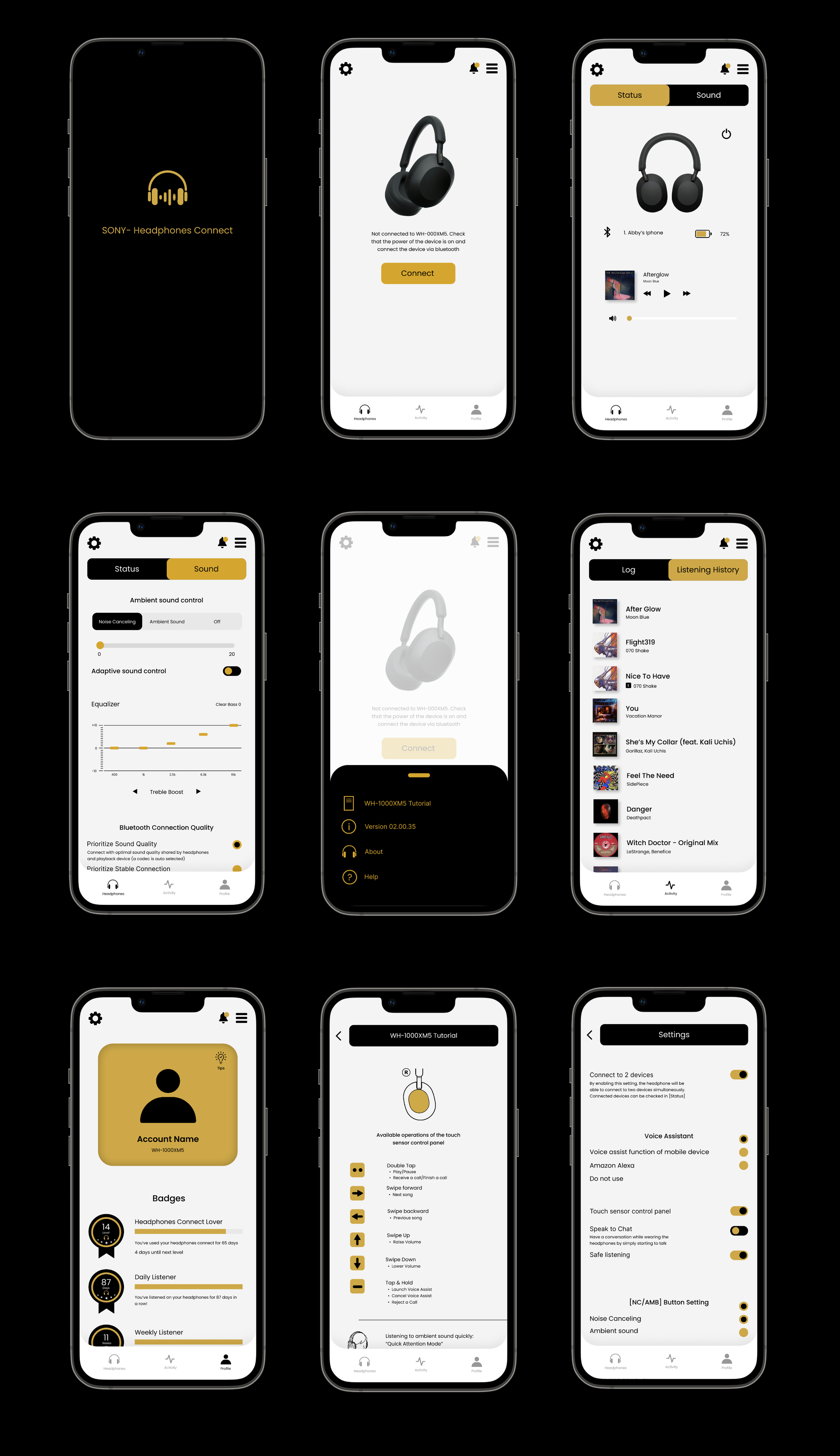
To address the app's organizational challenges, I developed visual sitemaps with key improvements. Notably, I renamed the final main navigation tab to “Profile" for better accuracy regarding its content. Additionally, I integrated the general settings page directly into the main “Headphones" section for improved accessibility.
Initial Visual Site Map:

1.3. Paper Prototyping & User Testing
The app's flow was tested and critiqued through a paper prototyping study with 15 users, allowing me to directly observe navigation patterns and identify points of user frustration. This early-stage feedback directly informed key organizational changes. Specifically, the “notifications," “menu," and “settings" access was moved to the home page for improved discoverability, and the “tips" section was restructured into a more user-centric “Profile" card.
Visual Site Map After Paper Prototyping:

1.4. Wireframing & Critique
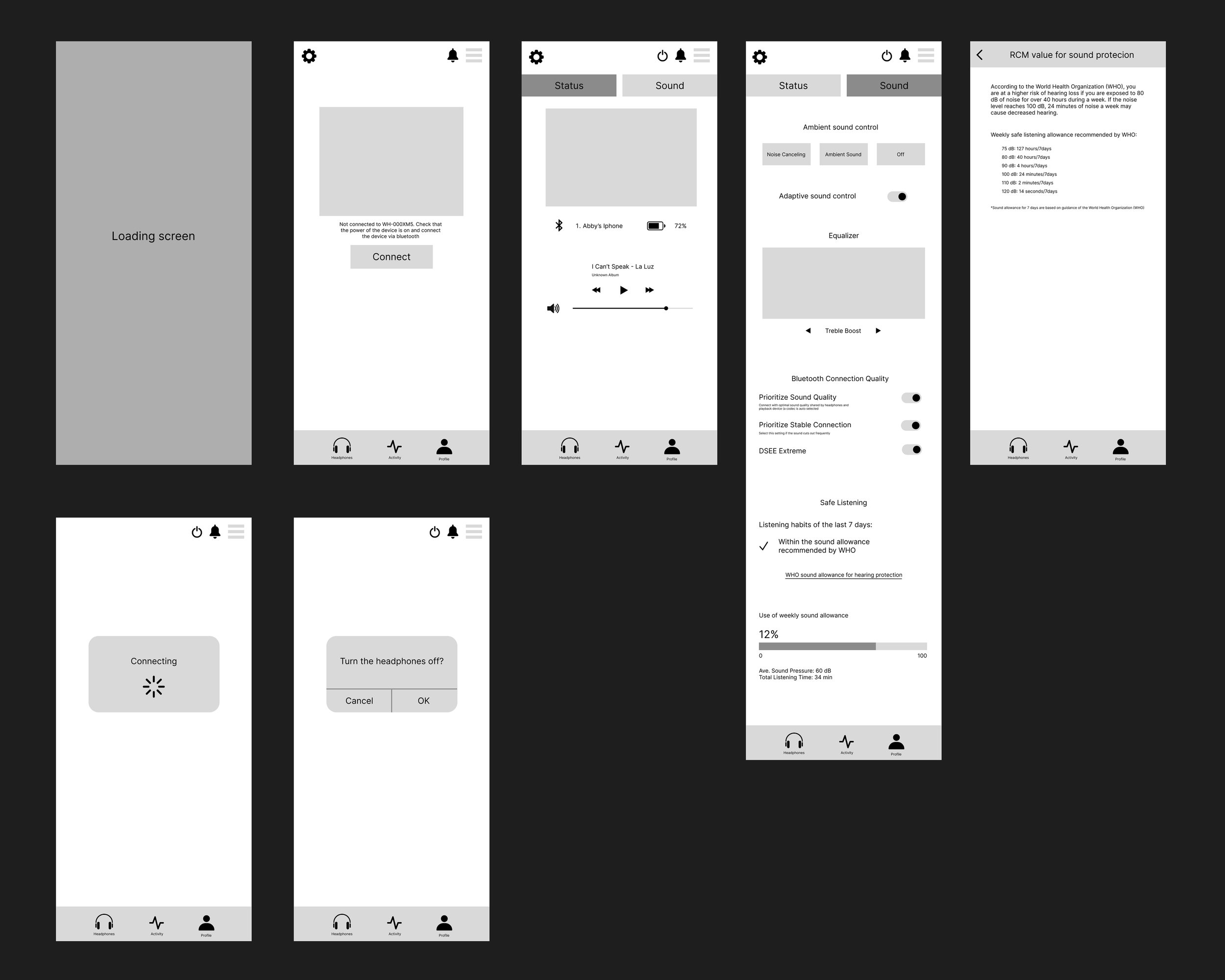
Following the development of the visual sitemap, the next stage involved creating a complete wireframe for the entire app. This detailed skeletal structure defined the layout and content placement for each page, also indicating where design elements would be integrated. This wireframe was reviewed and refined through several rounds of critique.
Final Wire Frame:


1.5. Final Design